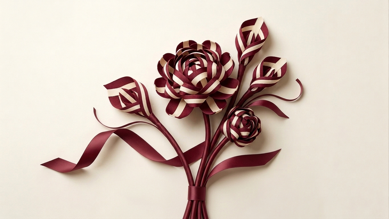
This visual is a sophisticated blend of heritage branding and cutting-edge technology. It reimagines the iconic Bally stripe—traditionally a linear, structured element—as a delicate, organic floral arrangement, symbolizing the multifaceted nature of motherhood.
Creative Concept & AI Execution (Midjourney)
The core imagery was developed using Midjourney, leveraging the tool's ability to interpret complex material textures.
The Prompting Strategy: The AI was guided to treat the Bally ribbon not just as a pattern, but as a physical material. By blending "sculptural floral design" with "burgundy and cream silk ribbons," the AI generated a unique botanical hybrid.
Materiality: Midjourney captured the realistic sheen of the ribbon and the structural integrity of the folds, giving the flowers a "couture" feel that aligns with Bally’s luxury positioning.
Refinement & Integration (Adobe Photoshop)
While the AI provided the artistic soul, Photoshop was essential for brand consistency and professional finalization:
Color Grading: Precise adjustments were made to ensure the burgundy and cream hues perfectly matched the official Bally brand palette, correcting any AI color drift.
Composite & Cleanup: Digital artifacts were removed, and the "stems" of the ribbon bouquet were refined to look seamless. The background was extended and neutralized to create a premium "gallery" feel.
Typography & Layout: The brand architecture was meticulously placed. Using a grid-based layout, the bold BALLY logo was balanced against the CTA and service icons to ensure a clean, high-end user experience (UX).
Process & Evolution
Phase 1: Material & Texture Exploration
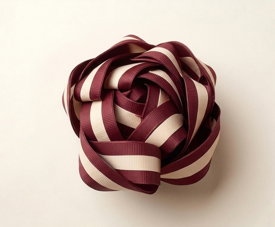
The initial phase was dedicated to creating the raw material. Using Midjourney, I engineered complex prompts to explore the physical properties of the iconic Bally stripe. This step was crucial to establish the realistic grosgrain ribbon textures, the depth of the folds, and the core palette of Bally Burgundy and Cream. The AI generated these intricate, sculptural rosette forms, which served as our 'botanical fabric'.
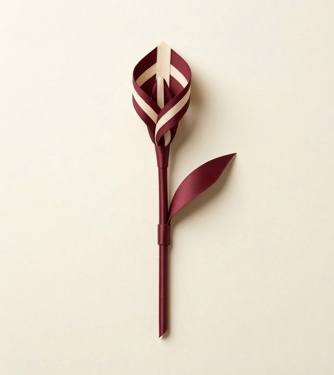
Phase 2: Isolation & Structural Selection
Moving from material to form, the next step was about selection and simplified Art Direction. I guided the AI to isolate a single, pure tulip-like shape derived from the ribbon geometry. This provided the conceptual anchor for the campaign. While this raw output defined the formal direction, it required meticulous human oversight to correct visual artifacts and prepare the single 'stem' for integration.
Phase 3: Composition & Brand Integration
The final phase, executed in Adobe Photoshop, involved transforming the single isolated form (Phase 2) into a complex, premium composition. I manually constructed the full bouquet by layering and compositing the refined tulip shapes, integrating multiple stems and swirling ribbons to create a dynamic visual metaphor of 'blooming affection.' Final brand integration was then performed using grid-based layouts to balance the BALLY logo against the campaign typography and service icons, ensuring a polished, luxury user experience.
Technical Breakdown
Feature Execution Tool
Conceptual Floral Art Midjourney (Text-to-Image / Style Reference)
Color Accuracy Photoshop (Selective Color & Camera RAW)
Brand Identity Photoshop (Vector Logo & Typography Integration)
Visual Texture Midjourney (Hyper-realistic fabric rendering)
This collaboration between Midjourney and Photoshop allowed for a visual that would be nearly impossible to photograph traditionally. It transforms a rigid brand asset into a poetic symbol of growth and affection, perfectly suited for a Mother's Day luxury campaign.
ALL RIGHTS TO THE CONTENTS OF THE SITE ARE RESERVED IN ACCORDANCE WITH CURRENT LEGISLATION.REPRODUCTION, PUBLICATION AND DISTRIBUTION, IN WHOLE OR IN PART, OF ALL THE ORIGINAL MATERIAL CONTAINED IN THIS SITE (INCLUDING, BUT NOT LIMITED TO, TEXTS, IMAGES, GRAPHIC ELABORATIONS) ARE EXPRESSLY FORBIDDEN WITHOUT AUTHORIZATION WRITTEN.